What Makes A Sign Dementia Friendly?
Posted by SALES THE CREATIVE PRINTER

Clear, accessible signage in aged care is important for residents and staff alike. When it comes to those living with dementia, having signage that is supportive and encourages independence and safety, can help make spaces more welcoming and easier to navigate.
When designing and selecting signage to use within any setting for those living with dementia, there are key elements that need to be incorporated for the signs to be considered dementia friendly. These include:
- Optimised Design Elements
- Appropriate Colour and Contrast
- Considered Location
In this article, we’ll go through how we factor this into the design and production of the signs we develop for aged care settings. These signs are Dementia Choices accredited by The Dementia Centre, ensuring that what we create meets the needs of those who they are intended for. They are printed on our repositionable material making them user-friendly and cost-effective when compared to traditional signage options.
Optimised Design Elements
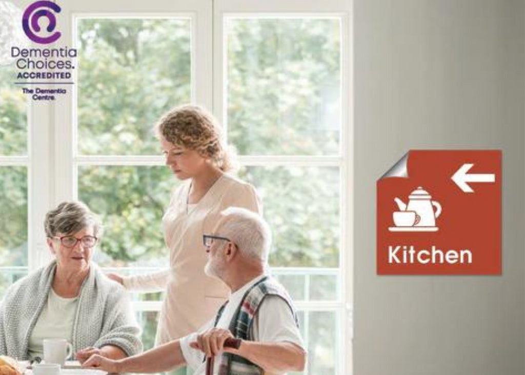
Familiarity is key when it comes to making signage dementia friendly. By choosing easy to recognise symbols or images for each sign you’re helping people to find their way and identify spaces. At The Creative Printer, we have a wide range of icons to choose from, all Dementia Choices Accredited, to ensure your residents and loved ones will be able to navigate their home with more safety and independence.
Another design element to consider for your signage is text. When you couple a clear icon with the associated text beneath it, the location is reinforced, which can help to reduce confusion. Easy to read fonts for the signage text is important, such as Arial typeface, as is keeping the wording simple. You’ll also want to ensure sentence case is used, as opposed to capital letters, as it makes the sign more accessible.
Where your signage is being used for wayfinding, another design element to consider are directional arrows. You can have a number of signs with the icon, text and relevant arrow placed within your residence guiding people to the destination. When residents arrive at the destination you can have a final sign featuring just the icon and text.

Appropriate Colour and Contrast
To ensure your signage is accessible, it’s important that the background colour contrasts with the icon and text in a way that makes it simple to see and read. At The Creative Printer we offer seven core colours for the background of your signage, each endorsed by Dementia Choices.
- Teal
- Chilli
- Blueberry
- Mushroom
- Olive
- Chocolate
- Cream
If you select a lighter colour background, then black is used for the icon and text. If you prefer a darker background, then white is the best contrast for icon and text.
When you’re deciding on the background colours for your signage, it’s important to consider where you are placing them, in terms of the colours of the walls. Where possible, select signage colours that will contrast well with the surrounding environment to enable residents to see them easily and clearly.
Considered Location
Ultimately, you want your signage to be a comforting addition to your residence for everyone who lives, works and visits, so it’s important that they’re placed in optimal locations. If a particular wall is already quite busy with competing messaging (be that safety signage, posters, artwork or anything else), be aware that your wayfinding or locational signage might get lost in the mix. Make sure the sign has a clear area surrounding it so that it is easy to see and read. Having adequate lighting around signage can also increase visibility.
The height of your signage is also worth thinking about. Placement within direct line of sight is ideal, however, some residents may tend to walk with a downward gaze, be using wheelchairs or walking frames or have a tendency to hunch, making any signage placed at standing eye level, or higher, difficult to see. Therefore, consider which residents need to be able to access the signage you are placing, and meet their visual needs.
If the signage is directional, how many different access points are there to the location you are guiding to? This will dictate the number of signs required so each approaching area is covered.

Integrate Dementia Friendly Signage For Care Homes into Your Residence
At The Creative Printer, we offer a range of fully customisable signage options to suit your residence and ensure clear and accessible messaging for all.
All of our signage is created with RPM Technology, which enables fast and easy application, removal and repositioning of signs to any surface type without damage, or need for costly and time-consuming fixtures.
We also offer antimicrobial protection to products should you wish to add infection protection to your signage. This adhesive film is active against airborne viruses and can further help support your residents, staff and visitors.
Contact our experienced team to discuss your requirements so we can produce signage that supports independence, easy navigation and safety and creates a calm and relaxed environment.


